Most business websites in Iowa fail for the same handful of reasons, and none of them are mysterious. The layout buries the point. The navigation makes visitors work. The site takes six seconds to load on a phone in Marshalltown. Good web design is not decoration; it is engineering for human attention. This guide covers the standards we hold every site to: layout, navigation, responsive behavior, accessibility, and speed, plus the part most guides skip, which is how those things translate into trust and paying customers.
We build and rescue websites across Iowa, from Des Moines to Davenport, and the patterns repeat. So let’s get into what actually works.
What Makes a Website Design “Good” in 2026?
A good website does four things: it loads fast, it makes the next step obvious, it works for every visitor on every device, and it looks like someone competent built it. That last one matters more than most owners think. The Stanford Web Credibility Project found that roughly 75% of users judge a company’s credibility based on its website design alone. Not the copy. Not the testimonials. The design.
Notice what is not on that list: animations, sliders, video backgrounds, or whatever the theme demo looked like. Those are garnish. A site that nails the four fundamentals with zero flash will outperform a beautiful site that fails any one of them, every time. Design is how it works, not how it sparkles.
How Should You Structure Your Website Layout?
Why does visual hierarchy matter?
Visitors do not read websites. They scan them. Eye-tracking research from Nielsen Norman Group shows users scan in rough F and Z patterns, hitting the top left first, skimming headings, and bailing the moment nothing looks relevant. Your layout either cooperates with that behavior or fights it and loses.
Practical rules we apply on every build:
- One clear headline above the fold that says what you do and who it’s for. If a stranger can’t answer “what does this company sell?” in five seconds, the layout failed.
- One primary action per screen. A hero with four buttons is a hero with zero buttons.
- Whitespace is a feature. Cramming content “above the fold” made sense in 2009. Now it just reads as clutter.
What does a clean structure look like under the hood?
Layout quality is also a code problem. We build with a flat DOM structure and modern CSS (Flexbox and Grid) instead of the nested-div soup that page builders love to generate. Fewer wrapper elements means faster rendering, easier maintenance, and fewer layout bugs on odd screen sizes. Brad Frost’s atomic design thinking applies here: build small, consistent components and assemble pages from them, rather than hand-crafting every page as a unique snowflake. Consistency is what makes a site feel professional; visitors notice when button styles drift between pages, even if they can’t articulate why the site feels off.
What Does Good Navigation Look Like?
The “don’t make me think” rule
Steve Krug wrote the only navigation rule you need as a book title: Don’t Make Me Think. Every time a visitor has to stop and figure out where something lives, you burn a little of their patience, and patience is the scarcest resource on the internet. Navigation labels should be boring and literal. “Services” beats “Solutions.” “Pricing” beats “Investment.” Clever labels are a tax on your visitors, paid to your ego.
Keep the main menu to five to seven items. If your menu needs a search party, your site structure needs a rethink, not a mega-menu.
How should you organize pages? (Hub and spoke)
We structure every site as hubs and spokes: a main page for each core topic, with related subpages linking back to it. Our own web design services page is the hub; pages like website rescue and guides like this one are spokes that feed it. Visitors always know where they are, search engines understand what you’re an authority on, and no page ends up orphaned three clicks from anywhere. It is the rare tactic that serves users and SEO equally well, which is why we treat it as non-negotiable.
What Are Today’s Responsive Design Standards?
Responsive design stopped being a feature around 2015. It is the baseline. Mobile devices account for over 60% of web traffic globally, and Google indexes the mobile version of your site first. If your site is “fine on desktop,” your site is not fine.
The current standard is mobile-first design: build for the small screen, then enhance for larger ones. In practice that means:
- Fluid layouts built with Flexbox and Grid, not fixed pixel widths
- Touch targets at least 44px, because thumbs are not cursors
- No horizontal scrolling, ever, on any screen width
- Zero layout shift: images and embeds get explicit dimensions so the page doesn’t jump around while loading
- Readable type without zooming: 16px minimum body text
One more standard that page builders routinely violate: never use tables for layout. Tables are for data. For everything else, flex and grid reflow gracefully on small screens; tables just get crushed. We rebuild layout tables into responsive grids on nearly every website redesign we take on.
How Do You Make a Website Accessible in Practice?
The WCAG 2.1 AA essentials
The WebAIM Million study, an annual accessibility audit of the top one million home pages, found WCAG failures on about 95% of them. That is not a hard bar to clear; most sites simply never try. The practical essentials:
- Color contrast of at least 4.5:1 for body text. Light gray text on white backgrounds is a design trend and an accessibility failure at the same time.
- Descriptive alt text on every meaningful image; empty alt on decorative ones.
- Keyboard navigation that reaches every interactive element in a logical order, with visible focus states. Removing focus outlines because they “look ugly” strands every keyboard user you have.
- Labeled form fields. Placeholder text is not a label; it vanishes the moment someone types.
- A logical heading hierarchy (H1, then H2s, then H3s) that reflects structure, not font-size preferences.
Why accessibility is a business decision, not charity
Laura Kalbag’s position on this is the right one: accessibility is not a bolt-on for a special audience, it is quality of craft that benefits everyone. Captions help people watching without sound in a waiting room. High contrast helps anyone using a phone in sunlight. Clear language helps every reader. Roughly one in four American adults lives with a disability (CDC), and in a state like Iowa with an aging population, designing past them is designing past your customers. Accessible sites also tend to be faster and better structured, which search engines reward. There is no version of this where accessibility costs you money.
Why Does Website Speed Matter So Much?
Core Web Vitals in plain language
Google measures site experience with Core Web Vitals. Ignore the acronyms; here is what they mean:
- How fast does the main content show up? (LCP) Target: under 2.5 seconds.
- How quickly does the page respond when tapped? (INP) Target: under 200 milliseconds.
- Does the page jump around while loading? (CLS) Target: it shouldn’t.
The stakes are documented. Google’s own research found 53% of mobile visitors abandon a page that takes longer than three seconds to load. Deloitte’s Milliseconds Make Millions study found that a mere 0.1 second speed improvement lifted retail conversions by 8.4%. Speed is not a technical vanity metric. It is revenue.
What actually slows WordPress sites down?
In our experience rescuing slow sites, the culprits are boringly consistent: bloated themes, plugin pileups, uncompressed images, and render-blocking scripts loading things nobody asked for. We wrote up the full diagnosis in why WordPress sites are slow, but the short version: most slow sites are carrying weight they don’t need, and the fix is subtraction, not a caching plugin stacked on top of the mess. Our standard build defers non-critical scripts, lazy-loads below-the-fold images, eager-loads the hero image, and skips the plugin buffet entirely.
How Do Design, UX, and Speed Drive Trust and Conversions?
Here is where it all connects, because none of the above matters if it doesn’t produce customers.
Trust is cumulative and fragile. A visitor who hits a fast, clear, professional site extends you a little credit. Every friction point spends it: a confusing menu, a form that fights back, a layout that shifts mid-tap. By the time they reach your contact form, they either have credit left or they don’t.
Conversion is focus. Oli Gardner’s conversion-centered design principle is the one we apply to every landing page: the page should have one job, and every element either supports that job or gets cut. His attention ratio concept is blunt math: one goal, one link that serves it. Ten competing links means each one is fighting the other nine.
The compounding effect is real. A site that loads in two seconds instead of six, makes its offer obvious instead of buried, and works flawlessly on a phone will convert multiples better than the pretty-but-broken alternative, from the exact same traffic. We see it on every redesign we ship: same business, same visitors, different results. Design quality is a multiplier on every marketing dollar you spend.
What Web Design Mistakes Do Iowa Businesses Make Most?
After a decade of building and rescuing sites across the state, these are the repeat offenders:
- Designing for yourself instead of your customer. You know where everything is on your site. Your visitors don’t, and they won’t dig.
- Treating mobile as an afterthought. “It works on my desktop” is the most expensive sentence in web design.
- Sliders and carousels. Nielsen Norman Group’s testing shows almost nobody interacts past the first slide. Pick your best message and commit to it.
- Stock-photo syndrome. Real photos of your team, shop, and work in Iowa beat glossy strangers shaking hands, every time. It is also an E-E-A-T signal search engines increasingly reward.
- No clear next step. Plenty of sites describe the business thoroughly and then just… end. Every page needs a destination.
- Set-it-and-forget-it. A website is not a brochure you print once. Plugins age, standards move, and unmaintained WordPress sites fail predictably.
If several of these sound familiar, that’s normal. It is also fixable, and usually without starting from scratch. Our free website audit will tell you which problems you actually have, in plain language, with no obligation attached.
Frequently Asked Questions
How much does professional web design cost in Iowa?
Most small business websites in Iowa run between $3,000 and $15,000 depending on scope, with ongoing care plans typically $50 to $200 monthly. Be suspicious at both extremes: $500 sites cost you more in lost customers than they save, and five-figure quotes for a basic brochure site are paying for someone’s overhead. Our pricing page breaks down what drives the number.
How do I know if my current website is hurting my business?
Three quick checks: load your site on your phone over cellular data and count the seconds; ask someone unfamiliar with your business to find your phone number in under ten seconds; and check whether your contact form actually delivers (test it, seriously). Failing any of these means you are losing customers you never knew you had. A free audit will quantify it.
Does website accessibility really apply to small Iowa businesses?
Yes, on two fronts. Practically, about a quarter of adults have a disability, and excluding them shrinks your market for no reason. Legally, ADA-related website lawsuits have been filed against businesses of every size, and small businesses are not exempt. The good news: building accessibly from the start costs little, and most fixes (contrast, alt text, labels, keyboard support) are straightforward.
How fast should my website load?
Main content visible in under 2.5 seconds on a mobile connection. That is Google’s threshold, and more importantly, it is your visitor’s. Past three seconds, half your mobile traffic is already gone.
Can I just use Wix or Squarespace instead of hiring a designer?
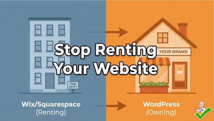
You can, and for a hobby or a brand-new venture testing an idea, you probably should. The tradeoffs show up at the growth stage: DIY builders limit your speed optimization, your SEO control, and your ability to fix structural problems, and migrating away later is painful. The honest framing is that a DIY site is renting; a professionally built site on WordPress is owning. If your website is a genuine sales channel rather than a digital business card, the math favors building it right. If you’re not sure which one describes you, that is exactly the question a free audit answers.
How often should a website be redesigned?
There is no fixed schedule, and “it looks dated” alone is a weak reason. Redesign when the site fails at its job: slow performance you can’t fix in place, a structure that no longer matches your services, or technology too old to maintain safely. Otherwise, continuous improvement beats periodic demolition. Many sites we see need a rescue, not a rebuild.
Ready to see how your site measures up? Get a free website audit from Team 218. We’ll tell you what’s working, what’s costing you customers, and what to fix first. No jargon, no pressure, no forty-page PDF of nothing.