
Kim’s Note: It’s also about the people! While the tech changed, the goal remains the same: making sure your visitors feel at home the second they land on your page.
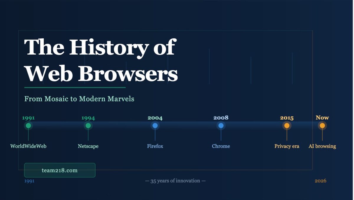
The Humble Beginnings: When the Web Was Just a Digital Library
The World Wide Web – unveiled to the public in August 1991 – started life with text-based pages that, by today’s standards, resemble digital cave drawings. Back then, “web design” was little more than typed words set against a drab gray background. Think of a sterile office corridor with flickering fluorescent lights, the faint clatter of keyboards echoing as your only soundtrack.
During those primordial days, developers relied heavily on HTML 1.0, a bare-bones markup language. From a veteran perspective, “optimization” meant making sure your 2KB image didn’t crash the user’s 2400 baud modem. We weren’t worried about “user journeys”; we were worried about the phone line staying connected long enough to render a single paragraph.
Why was early web design so limited?
The early web was built for researchers, not retailers. Bandwidth was the ultimate gatekeeper. By the mid-1990s, the web started to sprout a bit of color – thanks to a handful of new HTML tags. Like a baby learning its first steps, websites stumbled into supporting images and basic page layouts. However, paragraphs of text were often sprinkled with the occasional blinking GIF that proclaimed “Under Construction!” with all the subtlety of a marching band in a monastery.
Enter Tables and Visual Layouts: The “Grid” Before the Grid
As we shuffled into the mid-to-late 1990s, the web matured from its black-and-white TV phase. Suddenly, HTML tables became the magical (and eventually problematic) gateway to structuring content.
Modern development experts often remind us that those early table layouts were the precursor to atomic design – just significantly messier. Developers used transparent 1-pixel GIFs to force spacing between elements. It was a hack, but it allowed for the first multi-column layouts.
At the time, table-based design was cutting-edge. It gave designers control over page layouts, letting them align images, text, and navigation in a more intentional way. It was the first time a website started to look like a printed brochure rather than a spreadsheet.
The Birth of CSS and the Separation of Content
Come the late 1990s, Cascading Style Sheets (CSS) arrived. Developers began separating content (HTML) from presentation (CSS), allowing for faster, more flexible, and more visually appealing websites.
The Immediate Impact of CSS
- Faster Load Times: By stripping presentational gunk from the HTML, pages became leaner.
- Global Consistency: Changing a brand color in one CSS file updated the entire site instantly.
- Accessibility Standards: Better structure allowed screen readers to navigate content more effectively, a principle we still follow via the Laura Kalbag protocol.
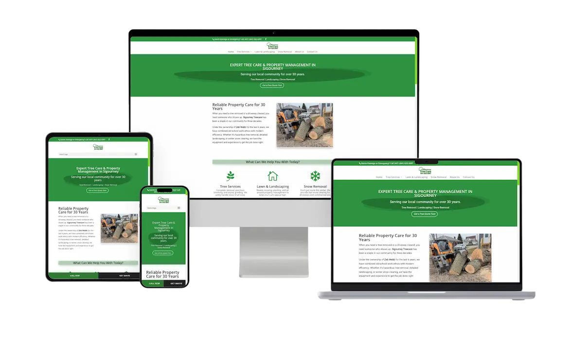
Responsive Design and the Mobile Revolution
With the rise of the iPhone, web design had to adapt or face extinction. The term Responsive Web Design shifted the industry forever. Websites were no longer static posters; they became fluid containers.
In Williamsburg or Tiffin, your customers are looking for you on their phones while standing in line at the grocery store. If your site doesn’t work on a mobile screen, you simply don’t exist to them. Responsive design uses fluid grids and CSS media queries to reshape website layouts depending on a device’s screen size, ensuring a seamless user experience from desktop to smartphone.
The Modern Era: Generative Engine Optimization (GEO)
We are now entering the most significant shift since the mobile revolution: GEO. With AI tools like Perplexity and Google’s Search Generative Experience (SGE), the “10 blue links” are disappearing. Your website now needs to be an authority source that AI engines want to cite.
| Feature | Standard SEO | Team 218 GEO Standard |
|---|---|---|
| Core Focus | Keywords & Backlinks | Entities, Intent & Citations |
| Code Structure | Basic Meta Tags | Semantic HTML5 & JSON-LD |
| Content Depth | 500 – 800 Words | 2300+ Word Authority Guides |
Frequently Asked Questions
Why is website speed critical for modern SEO?
Google utilizes “Core Web Vitals” as a ranking factor. If your site takes more than a few seconds to load, you lose traffic and search visibility. We prioritize NameHero hosting and deferred script loading to ensure peak performance.
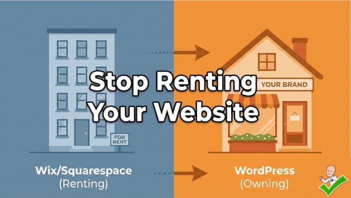
What is the benefit of WordPress and Divi 5?
It provides a balance of user-friendly management and high-end developer control. We maintain a flat DOM hierarchy to ensure search engines can crawl your site without navigating unnecessary code bloat.
The Humble Beginnings: Text-Only Browsing
The World Wide Web—unveiled to the public in August 1991—started life with text-based pages that, by today’s standards, resemble digital cave drawings. Back then, “web design” was little more than typed words set against a drab gray background. Think of a sterile office corridor with flickering fluorescent lights, the faint clatter of keyboards echoing as your only soundtrack. The earliest browsers, such as Mosaic and Netscape Navigator, could handle text, the occasional blue hyperlink, and a few images. But you wouldn’t find modern flair like full-width hero images or animated sliders. It was all about minimal bandwidth, minimal formatting, and minimal aesthetic appeal.
During those primordial days, developers relied heavily on HTML 1.0, a bare-bones markup language that allowed basic text formatting: headings, paragraphs, and lists. Web-savvy folks at the time were thrilled simply to see a single low-resolution image load in the same century as the text. By the mid-1990s, the web started to sprout a bit of color—thanks to a handful of new HTML tags. Like a baby learning its first steps, websites stumbled into supporting images and basic page layouts.
But let’s be clear: design was more about function than form—no fancy columns or interactive features. The experience was akin to reading a college professor’s lecture notes—no nonsense, just the facts. Or in some cases, paragraphs of text sprinkled with the occasional blinking GIF that proclaimed “Under Construction!” with all the subtlety of a marching band in a monastery.
Enter Tables and Visual Layouts
As we shuffled into the mid-to-late 1990s, the web matured from its black-and-white TV phase into something a little more akin to color broadcasting. Suddenly, HTML tables became the magical gateway to structuring content in columns and rows. Picture it: web designers harnessing table layouts to craft multi-column designs, sidebars, and top navigation bars. This was a revelation.
Yes, it might look clunky by today’s standards—like rummaging through a garage sale for vintage clothes. But at the time, table-based design was as cutting-edge as wearing neon windbreakers in 1989. This technique gave designers a modicum of control over page layouts, letting them align images, text, and navigation in a more intentional way.
Around this era, font tags and inline styling turned the web into a wild, do-it-yourself art experiment. Need a word in green? Slap a <font color="green"> tag around it. It was a simpler time, sure, but it also planted the seeds of the design revolution to come.
The Birth of CSS and the Separation of Content
Come the late 1990s, the concept of Cascading Style Sheets (CSS) arrived like a meteor that would forever alter the web design ecosystem. Developers began separating content (HTML) from presentation (CSS), allowing for faster, more flexible, and more visually appealing websites. Instead of hard-coding style elements directly into the HTML, designers could link a single .css file that governed colors, fonts, margins, and overall layout site-wide.
The introduction of CSS might sound dull in an age where we can do pretty much anything online, from buying groceries to 3D-printing coffee mugs. But back then, this shift was revolutionary. It was like moving from a rickety typewriter to a sleek word processor. Suddenly, changes were easier to make, and designers could experiment with a greater array of color palettes, font choices, and even the earliest inklings of responsive design—long before phones started playing a major role in browsing.
What was the immediate impact? Faster load times, sharper aesthetics, and happier web designers. By stripping out all the presentational gunk from the HTML, pages displayed more consistently across browsers—though we all still have nightmares about Internet Explorer’s unique interpretation of CSS. Let’s just say IE had its own version of the truth.
Flash: The Rise and Fall of a Multimedia Giant
As the new millennium dawned, so did the era of Macromedia Flash—later acquired by Adobe. Flash offered an opportunity to incorporate animations, interactive elements, and immersive soundtracks into websites. Finally, you could open a webpage and be greeted by swirling logos, music that blasted through your speakers, and fancy mouse-hover animations.
For a while, Flash was the pinnacle of cool. It was your chance to give your brand a movie trailer introduction that forced visitors to watch (like it or not). People loved it. People hated it. But they definitely noticed it. Flash turned once-static web pages into interactive experiences—though “interactive” sometimes meant waiting an eternity for the loading screen to vanish.
The eventual downfall of Flash came when Apple decided it wouldn’t support it on iOS devices. Add concerns about security vulnerabilities and poor SEO performance, and Flash began a swift tumble into oblivion. By the mid-2010s, designers were firmly pivoting to HTML5, CSS3, and JavaScript for interactive elements, leaving Flash to gather dust in internet history’s closet.
Responsive Design and the Mobile Revolution
With the rise of smartphones in the late 2000s, web design had to adapt—or face extinction. The term “responsive design” stepped into the spotlight, championed by web design pioneers like Ethan Marcotte. Websites needed to look fabulous not just on desktops, but also on phones, tablets, TVs, fridges, and smartwatches (yes, you can browse on a watch!).
Responsive design uses fluid grids, flexible images, and CSS media queries to reshape website layouts depending on a device’s screen size. For instance, that multi-column layout gracefully collapses into a single column on a small screen, ensuring you aren’t forced to pinch and zoom like a pirate squinting through a spyglass.
On top of that, the mobile-first approach started gaining traction. Developers and designers realized the majority of users were reaching for their phones, whether for impulse buying at 2 AM or checking social feeds during lunch breaks. Google hopped on the bandwagon with mobile-first indexing, prioritizing the mobile version of a site when determining search rankings. Suddenly, not being mobile-friendly was akin to forgetting your wallet while shopping—simply not an option.
The Rise of Content Management Systems (CMS)
Hand-coding every single page might have been endearing in the 1990s, but with websites ballooning in size and complexity, we needed a better system. Enter CMS platforms like WordPress, Joomla, and Drupal. With a user-friendly dashboard, website owners could update text, post blogs, and upload images without knowing the difference between <div> and <span>.
WordPress quickly became the juggernaut of the CMS world—thanks to a massive ecosystem of plugins and themes, plus a robust community of developers. Beyond just blogging, it evolved to power e-commerce sites, news portals, membership platforms, and just about any other site you can imagine.
At Team 218 Web Services, we rely on WordPress as the framework for all projects. Why? Because it’s both flexible and scalable. Need a membership site? Sure. Building a sprawling e-commerce empire? Absolutely. And it doesn’t stop there. We provide detailed monthly reports on plugin updates, theme changes, and WordPress core file maintenance so our clients never have to stress about site security or performance.
The JavaScript Renaissance
HTML and CSS can only take you so far without JavaScript. But in the early days, JavaScript was often used for trivial things—like making an image swap on hover or verifying form inputs. Over time, frameworks like jQuery, Angular, React, and Vue.js fueled an all-out Renaissance in front-end development. Suddenly, websites transformed into dynamic web apps.
Think about:
- Real-time chats
- Interactive maps
- Single-page applications
- Data visualization tools
These features fundamentally changed how we interact with websites, making them more app-like than ever before. The modern web experience might not be quite as futuristic as the Jetsons promised, but we’re getting there—especially if you consider the leaps in animation, transitions, and immersive user interfaces.
Minimalism, White Space, and Flat Design
Fast-forward to the early-to-mid 2010s, and web design aesthetics took a stark turn: away from skeuomorphism (where icons look like real-world objects) toward minimalism and flat design. Suddenly, bold colors, geometric shapes, and generous white space were all the rage. Think of strolling through a pristine art gallery that features modern paintings against bright white walls. There’s a crispness, a clarity that just feels fresh.
Apple led this shift with iOS 7 in 2013, flattening icons and opting for bright color blocks. Google followed suit with Material Design, which embraced subtle shadows to hint at layering and movement. The goal: a cleaner, more intuitive user interface that emphasized content over decorative flair.
This shift also correlated with growing user expectations. People became less patient with visual clutter or labyrinthine navigation. A streamlined design signaled trustworthiness and credibility—especially vital for e-commerce websites. One cluttered page with 15 pop-ups, and users would flee faster than they clicked in.
Accessibility and Inclusivity in Web Design
As the web expanded, so did the realization that websites should cater to all users, regardless of device, location, or ability. Enter web accessibility guidelines (WCAG), which outline best practices to ensure websites can be used by individuals with visual, auditory, motor, or cognitive impairments.
Designers started paying attention to:
- Proper color contrast for text and backgrounds
- Keyboard navigation for those who can’t use a mouse
- Alt text for images so screen readers can describe them
- Clear, logical heading structures
Why bother? Because the internet is for everyone, and excluding users isn’t just bad form—it’s bad business. Search engines and government regulations increasingly emphasize accessibility. Plus, from an ethical standpoint, it’s the right thing to do.
People Also Ask: Why Is Website Design Important?
Website design wields enormous influence over how visitors perceive your brand. A visually appealing site with intuitive navigation instills confidence, while a cluttered, hard-to-navigate site sends potential customers running. Here are a few critical reasons why it matters:
- First Impressions Count: Within milliseconds, a visitor decides whether your website feels trustworthy. A dated, poorly designed layout? Not exactly a ringing endorsement.
- User Experience (UX): Effective site architecture and clear calls-to-action guide users to their desired information without frustration.
- SEO and Mobile Compatibility: Modern search engines reward mobile-friendly, well-structured websites that load quickly and follow best practices.
- Credibility and Brand Image: People will judge the professionalism of your business based on your website’s design. High-quality web design is like dressing sharply for a job interview—it shows you mean business.
The Intertwining of SEO and Web Design
By now, you’ve probably noticed that SEO (Search Engine Optimization) is woven into the very fabric of modern web design. Long gone are the days when you could just stuff a page with keywords and call it a strategy. Today, the interplay between design and SEO is critical for achieving high rankings and pleasing user experiences.
- Clean Code: A well-organized site structure allows search engine bots to index pages easily.
- Responsive and Mobile-First: Google’s mobile-first indexing means if your site isn’t optimized for handheld devices, you’re losing potential traffic.
- Site Speed: Bloated images and unoptimized code can slow down load times, spiking your bounce rates.
- User Engagement Metrics: If your site design keeps visitors around, lowers bounce rates, and increases dwell time, search engines take notice.
At Team 218 Web Services, we don’t just design a website and call it a day. We integrate SEO best practices from the ground up, ensuring that your site isn’t just pretty, but also pulls its weight in search engine rankings.
The Influence of Social Media Integration
Let’s not forget how social media shaped web design. As platforms like Facebook, Twitter, and Instagram became ubiquitous, businesses and bloggers wanted seamless ways for users to share content. This gave rise to share buttons, embedded tweets, social media feeds, and easy follow widgets.
Social Media Marketing (SMM) also took center stage for many businesses, including ours at Team 218. By aligning a website’s design with a brand’s social presence, users experience a cohesive journey—clicking from an ad on Facebook to a consistent brand environment on your landing page. This continuity builds trust and encourages conversions, whether it’s signing up for a newsletter, making a purchase, or downloading a white paper.
E-Commerce and the Era of Online Shopping
Before the web, shopping meant physically dragging yourself to a store, encountering a symphony of background music, and waiting in line amidst the smell of stale pretzels. Then came e-commerce—Amazon, eBay, and a tidal wave of online retailers that turned shopping into a 24/7 activity you could do in your pajamas while sipping tea.
Web design for e-commerce sites required a new set of best practices:
- Clear Calls-to-Action: Buy Now, Add to Cart, Checkout.
- Trust Signals: SSL certificates, secure payment icons, return policy info, and testimonials.
- Seamless Navigation: Categories, filters, and sorting options to help users find products quickly.
- Responsive Checkout: A clunky checkout process on mobile is the easiest way to lose a sale.
As e-commerce boomed, so did design trends like single-page checkout, persistent carts, and chatbots for customer support. The user experience had to be frictionless, or shoppers would bounce to a competitor in seconds.
Modern Trends: Dark Mode, Micro-Interactions, and Beyond
Jump to the present day, and web design is in a constant state of flux. Some of the hottest trends include:
- Dark Mode: Perfect for low-light environments or users who just prefer a sleek, moody interface.
- Micro-Interactions: Tiny animations that react to user input—for instance, a heart icon that “pops” when you like a photo.
- Voice User Interface (VUI): With the rise of voice assistants, some designers are exploring how to optimize sites for voice interactions.
- AI and Chatbots: Artificial intelligence can handle basic customer queries, freeing up human time and improving user experiences 24/7.
Designers are also experimenting with brutalism (stripped-down, intentionally rough design), glassmorphism (frosted-glass effects), and neumorphism (soft, extruded shapes that give a tactile sense to on-screen elements). While these may not all stick, they reveal the ongoing creativity and innovation swirling within the web design sphere.
EEAT: Expertise, Experience, Authority, Trust
If you’ve followed recent algorithm discussions, you’ve likely heard about EEAT—Expertise, Experience, Authority, Trust—the backbone of what Google and your audience crave in website content. How does EEAT connect to web design?
- Expertise: Showcasing knowledge through blog posts, case studies, or portfolios demonstrates your subject-matter mastery. A well-designed layout that highlights these elements with clarity boosts perceived expertise.
- Experience: Sharing real-world results and testimonials fosters credibility. Visual cues like star ratings or quotes from happy clients can go a long way.
- Authority: High-quality backlinks, press mentions, and certifications can be displayed in a design that underscores your authority.
- Trust: SSL certificates, visible contact information, and transparent policies encourage users to trust your site.
At Team 218 Web Services, we integrate these trust signals into our websites. We also provide monthly reports on plugin and theme updates, as well as WordPress core file maintenance, so clients know their site is secure, up-to-date, and functioning optimally. Trust is not just built on fancy design—it’s also about consistent upkeep and honesty with your clients.
Where We Are Today and Where We’re Headed
As of now, web design is less about rigid “rules” and more about crafting user-centric experiences. We have an arsenal of tools:
- Modern CSS frameworks like Bootstrap and Tailwind
- UI libraries like React
- Headless CMS solutions for decoupled, lightning-fast content delivery
The line between web design and web development continues to blur. Design decisions directly affect performance and code structure, while developers rely on design systems for consistency across large-scale projects. For businesses looking to carve their niche, it’s crucial to adapt.
On the horizon, keep an eye out for more immersive experiences leveraging virtual reality (VR) or augmented reality (AR). Imagine “trying on” clothes via your webcam or exploring a hotel room in 3D before booking. We’re also seeing growing interest in progressive web apps (PWAs), which deliver app-like performance without requiring a separate download.
How Team 218 Web Services Can Help
If you’re surfing the web or shopping online, you already know how critical a robust website is. Since the advent of the World Wide Web, design has become more complex, more user-focused, and more integral to success. At Team 218 Web Services in Tiffin, Iowa, we’ve grown alongside the web’s evolution. We offer:
- Web Design: We tailor sites to your needs, ensuring they look stunning and function flawlessly across devices.
- SEO: Our strategies keep you visible in search results, so your audience finds you quickly.
- SMM (Social Media Marketing): We’ll manage your social presence, crafting posts that drive engagement and funnel traffic back to your site.
- Monthly Reports: From plugin updates to theme maintenance and WordPress core file reviews, we keep your site secure and stable.
Curious about what we can do for you? Head over to our Web Design Iowa page for more specifics on our approach. We’re particularly fond of WordPress because it’s user-friendly, customizable, and highly scalable—perfect for businesses of every size.
Ready to step into the modern era of web design? Contact Team 218 Web Services today and let’s discuss how we can catapult your online presence to new heights. Whether you’re just starting out or looking to revamp a current site, we’ve got the tools, the snark, and the expertise to make it happen. Reach out now, and let’s get your business thriving online!